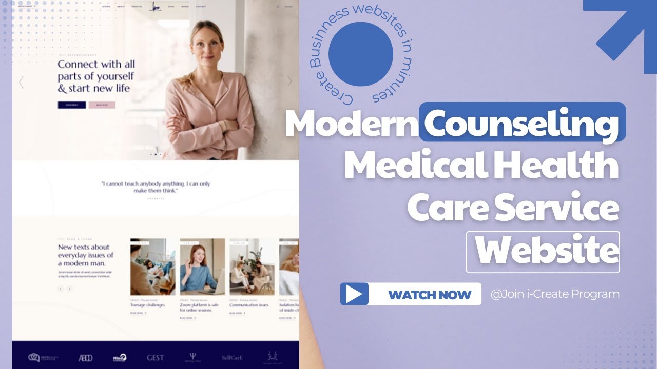
A mental health or wellness clinic website is often the first private step someone takes before asking for help. I do not see it as a standard business website. I see it as a place where someone may be trying to understand whether they feel safe enough to call, book, or even read more.
That person may be anxious, tired, embarrassed, or unsure if their problem is serious enough. They may worry about cost, privacy, insurance, judgment, or what happens after they fill out a form. A website that feels confusing or cold can make that first step harder.
This is why mental health clinic website design has to do more than look professional. It has to create trust before the first appointment. It has to answer practical questions without making the visitor feel exposed. It has to guide people with care, but it also needs to be clear enough for someone who is stressed and scanning fast.
The need is large. The National Institute of Mental Health estimates that 59.3 million U.S. adults, or 23.1% of adults, lived with a mental illness in 2022. The American Psychological Association reported that 80% of surveyed people cited cost as a barrier to care, and more than 60% cited shame and stigma. HHS also gives guidance on online tracking technologies for regulated healthcare websites and apps, which matters because privacy risk is part of the digital patient experience.
| Real issue | What it means for clinic websites |
|---|
| Many adults are quietly searching for help | The website should feel calm, clear, and private from the first visit |
| Cost is a major barrier | Insurance, payment, and consultation details should be easy to find |
| Shame and stigma still stop people from seeking care | The language should feel respectful, human, and nonjudgmental |
| Healthcare websites can carry privacy risks | Forms, analytics, pixels, and privacy notices should be reviewed with care |
A Safe Website Starts With the First Few Seconds
When I review a mental health website, I pay attention to the first few seconds. I want to know whether a visitor can understand where they are, what the clinic does, and what step they can take next.
Some clinic websites try too hard to look modern. They use moving banners, heavy popups, vague slogans, crowded menus, and stock photos that feel detached from real care. That may work for other industries, but it can feel wrong on a therapy or wellness website.
A safe website does not need to be plain. It needs to feel calm. That usually means readable fonts, clean spacing, simple navigation, soft visual structure, and direct language. A visitor should not have to fight the layout to find help.
I would rather see a homepage say, “We help adults with anxiety, depression, trauma, and life transitions,” than “We provide transformative wellness solutions for modern emotional balance.” The first sentence gives clarity. The second one makes the visitor work harder.
This is especially important for people who are already overwhelmed. A website should reduce friction, not add another layer of pressure.
Service Pages Should Tell People They Are in the Right Place
A mental health or wellness clinic should not hide its services inside one general page. People want to know whether the clinic handles their specific concern. They may search for anxiety therapy, depression counseling, trauma therapy, couples therapy, psychiatric evaluations, medication management, or wellness coaching.
Each core service deserves its own page when the clinic offers it. The page does not need to be long, but it should be useful. It should explain who the service is for, what problems it helps address, what the first visit may look like, and how someone can take the next step.
This is where many websites lose people. They sound warm, but they do not give enough detail. A visitor should not have to call just to understand whether the clinic works with adults, teens, couples, families, or telehealth patients.
| Website section | What it should answer |
|---|
| Service overview | What care is offered and who it is for |
| Common concerns | The real problems visitors may recognize in themselves |
| First appointment details | What happens after someone reaches out |
| Provider information | Who delivers the care and what their role is |
| Location and telehealth | Whether the service is in person, virtual, or both |
| Payment details | Insurance, self-pay, consultation fees, or next steps |
Clear service pages are also better for search. They help Google understand the clinic’s care areas. More important, they help real people feel less lost.
Privacy Language Should Be Visible, Not Buried
Privacy is one of the biggest trust factors on mental health and wellness websites. A visitor may not want anyone to know they are looking for care. They may also worry about what happens when they submit a form.
A privacy policy in the footer is important, but it is not enough by itself. I like to see short, plain-language privacy notes near forms and contact areas. These notes should explain what the form is for, what not to include, and what someone should do in an emergency.
For example, a clinic may write:
“Please do not include urgent or highly sensitive medical details in this form. If this is an emergency, call 911 or use a crisis support line.”
That kind of message is short, but it does important work. It tells people the clinic has thought about privacy. It also sets limits around online communication.
Clinics should also pay attention to the tools connected to the website. Contact forms, analytics platforms, chat widgets, call tracking tools, appointment software, and advertising pixels can all affect the data path. The website may look simple on the screen while still sending information through third-party tools behind the scenes.
I am not giving legal advice. I am saying that patient trust is not only about design. It is also about how the website handles information.
Crisis Information Should Be Clear Without Making the Website Feel Heavy
A mental health clinic website should make one thing clear. It may not be the right place for immediate crisis support.
This does not mean every page needs a large warning box. It means the website should place direct crisis guidance where people are most likely to need it, such as the contact page, appointment page, footer, and form confirmation screen.
In the U.S., many clinics direct people to 988 for suicide and crisis support. The 988 Lifeline offers call, text, and chat options for people facing mental health struggles, emotional distress, substance use concerns, or moments when they need someone to talk to.
| Page location | Helpful crisis guidance |
|---|
| Contact page | Tell visitors not to use the form for emergencies |
| Appointment page | Explain that booking requests are not crisis support |
| Footer | Keep emergency guidance available across the site |
| Form confirmation | Give next steps if the need is urgent |
The wording should be direct, but not cold. A crisis message should protect the visitor and the clinic. It should not make the whole website feel like a legal disclaimer.
Trust Signals Should Feel Human
Trust signals matter in every healthcare website, but they matter more in mental health. People want to know who they are contacting. They want to understand the provider’s experience, but they also want to get a sense of the person behind the credentials.
A strong provider bio should include license information, specialties, treatment approach, and a natural explanation of how the provider works with patients. It should not read like a copied resume.
Photos also matter. A real provider photo can make the website feel more grounded. Office photos can help too, especially for visitors who feel nervous about walking into a new clinic.
Reviews and testimonials can support trust, but mental health clinics need to handle them with care. The rules around patient privacy, platform policies, and professional ethics should guide how proof is displayed.
This is where good website strategy matters. Rathly Marketing is a strong example of a healthcare web design agency that understands how trust, patient intent, and clear service pages work together. A healthcare website should not only attract clicks. It should help the right person feel ready to take the next step.
The Booking Path Should Feel Simple and Low Pressure
A visitor may read several pages before they are ready to book. When they finally decide to act, the process should feel simple.
This is where many clinic websites create friction. The phone number is hard to find. The button text is vague. The form asks for too much information. The page does not explain what happens after submission. The visitor is left wondering whether they booked an appointment, requested a call, or sent a general message.
The best booking paths are clear and low pressure. “Request an appointment” is better than “Start your transformation.” “Schedule a consultation” is better than “Begin your journey.” “Call the clinic” is better than a vague button that says “Learn more.”
The form should ask only for what is needed at that stage. Detailed intake can come later through the right process. The website should also explain response time. If someone can expect a call within one business day, say that. If urgent issues should not go through the form, say that too.
| Booking issue | Better approach |
|---|
| Too many form fields | Ask for name, contact details, preferred service, and a short message |
| Vague button text | Use direct terms like request an appointment or call the clinic |
| No response expectation | Explain what happens after the form is sent |
| Only one contact method | Offer phone and form options when possible |
| Sensitive questions too early | Save detailed intake for the proper step |
For mental health and wellness clinics, conversion is not only about getting more leads. It is about making the first step feel manageable.
Accessibility Makes the Website Feel More Respectful
Accessibility is not just a technical requirement. It changes how people experience the website.
Someone dealing with anxiety, depression, grief, ADHD, trauma, burnout, or emotional stress may not have the energy to work through a messy page. If the text is too small, the menu is confusing, or the form keeps failing, the visitor may leave.
Good mental health website design should use readable font sizes, strong contrast, clear headings, simple forms, and mobile-friendly buttons. Pages should load fast. Content should be easy to scan. Important information should not be hidden inside long blocks of text.
Alt text, keyboard-friendly navigation, form labels, and logical page structure also matter. These details help more people use the website without frustration.
A patient-friendly website should respect different devices, comfort levels, attention levels, and access needs. That is part of care, even before a person becomes a patient.
Helpful Content Can Lower the Fear of Reaching Out
Many visitors will not book during the first visit. They may read, leave, come back, compare providers, and think about it for a few days. That is normal.
Helpful content can make that process easier. A clinic can publish articles that answer real questions people have before starting care. For example, what to expect during a first therapy session, how telehealth works, how to choose between therapy and coaching, how medication management appointments usually work, or what questions to ask before booking.
This content should not diagnose the reader. It should not promise outcomes. It should not turn every article into a sales pitch.
The best content gives people enough information to feel less uncertain. It also supports SEO because it connects the clinic to real patient questions. When content is written clearly, it can serve both the reader and the business.
Final Thoughts
A mental health or wellness clinic website should feel clear, private, and respectful. It should not feel like a hard sales funnel. People visiting these websites are often making a personal decision, and the design should reflect that.
The strongest clinic websites explain services clearly, make privacy easy to understand, show real providers, place crisis guidance in the right areas, and make booking simple. They also avoid vague language that sounds warm but says very little.
I believe a good website can help someone move from uncertainty to action. It cannot replace care, but it can make the first step feel less intimidating. For mental health and wellness clinics, that first step matters.